Tuesday, July 23, 2024

3 powerful ways to conserve energy in 2024

The United States (U.S.) accounts for more than 80% of the energy consumption in North America. The energy industry – among other industries – add their fair share to this energy consumption and also contribute to global warming.

These problems affect the planet and they also create additional business expenses – especially for large emitters of carbon dioxide. As we know, energy costs are skyrocketing in the U.S. and Canada and companies are facing immense pressure to cut costs and be better global citizens. But what’s the best way? By improving energy efficiency.

Below we’ve identified a few solutions that will help energy companies slash their energy bills, increase profitability, and gain a competitive edge.

Energy supply and demand in North America

North America has a population of about 380,058,111 in 2024. This massive and diverse continent also has a large – and interconnected – energy industry. These facilities power our homes, businesses (e.g. engineering companies), transportation hubs and play their part in the region’s economic and social well-being. However, this large population, and its industries, also consumes more energy than a decade ago.

energy efficiency in energy facilities

What are the major energy facilities in North America?

North America energy facilities include:

  • Power Plants
  • Petroleum Refineries
  • Natural Gas Processing Plants
  • Biomass and Geothermal Plants

The power plants come in various forms, each using different resources to generate electricity. Coal-fired plants, hydropower plants, and wind and solar farms are some of the most common ones. One of the biggest power plants in North America is Grand Coulee, which produced 20.3 million MWh of hydroelectricity in 2020. There are also petroleum refineries that process crude oil into gasoline, diesel, and other products that fuel our cars, airplanes, and various industries.

Additionally, natural gas processing plants process gas before being transported to consumers and industries. Biomass and geothermal plants derive energy from organic materials like wood and crops, while geothermal plants tap into the heat stored deep within the earth.

Forms of energy used in North America

Now let us tell you about the form of energy used in North America. Just like most other populated region of the world, North America consumes many types of energy including:

  • Electricity
  • Fossil fuels (oil, natural gas)
  • Renewable energy
  • Nuclear energy

Energy consumption within facilities

Energy facilities themselves consume a significant amount while generating and distributing energy. They must provide power to machinery and equipment and maintain optimal operating temperatures – processes that require energy. Here are some examples:

  • In power plants – energy is used for pumps, cooling systems, and auxiliary equipment to draw energy from their own output to keep the plant running.
  • In oil refineries – energy is used in refining processes that require heat and power for distillation, separation, and other operations.
  • In natural gas plants – energy is used for compression, dehydration, and treatment processes that consume energy before the gas is delivered.
  • In renewable energy facilities – energy is used for tracking, inverting, and grid integration.

Why energy facilities need to optimize energy usage

There is growing energy consumption within energy facilities across North America. That’s why there’s a growing focus on improving efficiencies. There are technologies like automation, cogeneration, and smart energy management systems that can help reduce internal energy use. These efforts not only benefit the facilities themselves but also contribute to a more sustainable and efficient overall energy system.

Ways to improve energy efficiency in 2024

energy efficiency in energy facilities

1. Use the latest technologies

The first thing energy facility operators must do is adopt the latest technology available. These include smart systems and automation tools that help in making operations energy efficient. They can also implement technologies like smart monitoring, data analytics, and automation that can pinpoint inefficiencies, optimize resource allocation, and automate energy-saving measures.

For example, intelligent ventilation systems adjusting to occupancy levels or AI-powered predictive maintenance preventing energy-guzzling breakdowns. At the same time, you have digital twins – virtual replicas of physical facilities – that can be used to model and test energy-saving scenarios before real-world implementation. Optimization platforms, fed by real-time data, can dynamically adjust operations for maximum efficiency.

When you have advanced monitoring and diagnostics by deploying intelligent sensors and diagnostics tools across facilities, you easily identify energy leaks, anomalies in equipment performance, and areas for targeted efficiency improvements.

2. Upgrading with modernization in mind

Your infrastructure might be working on the old grids and layouts that consume more energy than modern systems. As we know, many North American energy facilities are burdened by outdated equipment and processes. These outdated infrastructures decrease overall output while requiring more energy.

Operators should upgrade to high-efficiency boilers, turbines, pumps, and control systems that can dramatically reduce energy consumption. They can also consider replacing coal-fired boilers with cleaner, more efficient natural gas options.

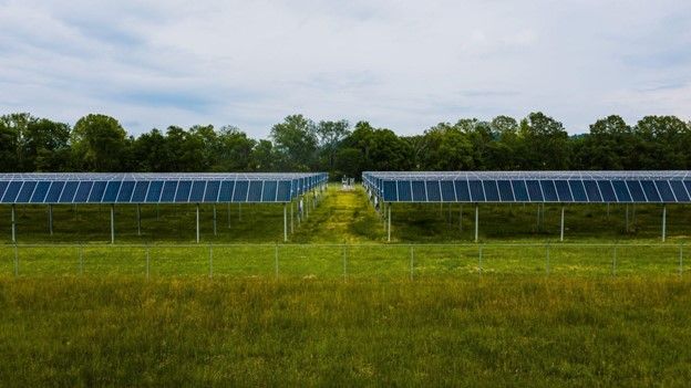
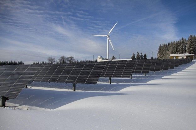
Besides these upgrades, it’s a great idea to consider renewable energy sources like solar, wind, and geothermal which can significantly reduce dependence on fossil fuels and their inherent inefficiencies. Most energy consumption also depends on the building’s usage. Operators should install improved insulation and energy-efficient lighting and optimize the building envelope to minimize energy losses and create a more sustainable environment within the facility.

3. Build a culture of energy efficiency

What if your employees are not aware of the facility’s total energy consumption? It is important that you instill a sense of energy conservation within your employee base. Operators should also conduct relevant training programs focused on energy-saving practices and also incentivizing sustainable behavior. These actions can lead to sustained efficiency improvements across the board.

Cultural change also depends on the operator’s leadership team and overall corporate commitment to energy efficiency. This commitment needs to take the form of clear policies and actionable plans in order to set the tone for the entire organization. Operators should also consider setting ambitious energy reduction targets and holding departments accountable for achieving them.

Final thoughts

Energy efficiency in 2024 should be a major goal of energy facilities to ensure a sustainable future. This is a chance for North American energy facilities to reduce their environmental impact, lower operational costs, enhance profitability, and ensure a more secure energy future for all.

Looking for a partner for your energy efficiency project?

Vista Projects is an integrated engineering services firm able to assist with your energy efficiency projects. With offices in Calgary, Alberta, Houston, Texas, and Muscat, Oman, we help clients tailor engineering phases for the unique needs of their projects. Contact us today!

Looking for your next (last?) great job at a great EPC firm?

Vista Projects is hiring for multiple roles in engineering and system integration – apply today!


source https://www.vistaprojects.com/ways_to_conserve_energy_in_2024/

source https://vistaprojects2.blogspot.com/2024/07/3-powerful-ways-to-conserve-energy-in.html

Tuesday, July 16, 2024

Analyzing your data using Pivot Tables and Pivot Charts

Pivot Tables and Pivot Charts are tools that can help you summarize, explore, and visualize your data quickly and efficiently. Pivot Tables provide summaries in tabular format while Pivot Charts summarize this in graphical formats. As the names suggest, Pivot Charts are created from Pivot Tables and Pivot Tables can be created from a Power Pivot model as well as a worksheet table or range, and external data source.

Using Pivot Tables

A Pivot Table is different from a regular table as it allows you to quickly summarize large datasets, rearrange, filter, and group data without altering the original data set. 

How to Create a Pivot Table from a Power Pivot Data Model

  1. Navigate to the “Insert” tab and select “PivotTable”
  2. If you already have data loaded to Power Pivot, select “From Data Model”
  3. Decide whether to place the Pivot Table in a new worksheet or an existing one

How to configure a Pivot Table

A “PivotTable Fields” panel will open on the right. This field list panels contains all objects (tables and queries) that you can use as data sources for the pivot table. It also has areas where you can drag table fields into. 

  1. Filters Area – Drag data source fields/columns that you want to use as filters.
  2. Columns Area – A pivot table has rows and columns, drag source fields that you want arranged horizontally.
  3. Rows Area – Just like columns, drag source fields that you want arranged in rows.
  4. Values – Drag source fields that you want to aggregate. You can also choose different aggregation functions like Sum, Average, Count, Max, and Min.

Watch the video below to see how you can create Pivot Tables from a data model.

Using Pivot Charts

Pivot Charts are graphical representations of data summarized in Pivot Tables. They provide a simpler of viewing tabular data so that it is easier to see trends, patterns, and comparisons in your data so that you can quickly interpret and present your results.

To create a Pivot Chart, select a Pivot Table, in the “Insert” tab under the “Charts” group, select “PivotChart.” A dialog box will appear that allows you to choose the kind of chart you prefer.

How to choose the right chart for your data

The type of chart you choose depends on what message you want to communicate from your data. For example, when showing comparison, a bar chart or column chart are best suited for showing comparing categories. When you want to show total procurement spend by category, since each bar/column might have a different height, this can be quickly interpreted as either being more than or less than. Choose a bar when the category names have long text or cannot all fit well in a column chart. 

When showing Trends or continuous time periods, select a line chart. For example, the sales trend per month. If the line has a continuous drop from month to month, this can be quickly interpreted as a drop in sales and vice versa.

When showing proportions of a whole, choose a pie or doughnut chart. For example, when you want to show the percentage of open and closed orders out of all orders. However, if the proportions being compared have a large count, consider using a column or bar chart to avoid clutter in the pie or doughnut chart. 

Categorical data types are suited for bar, column, pie, or stacked charts. Numerical data types are best displayed using line, scatter, bubble, or histogram charts. A time series is  quickly interpreted using line, area, or column charts.

When your analysis goal is to show comparison, choose a column, bar, or line chart. If you want to analyze the distribution, use a histogram, box plot, or scatter plot. If you want to analyze the trend over time, use a line or area chart. When analyzing proportions, use a pie, doughnut, or stacked charts and when analyzing the relationship between in your data, use scatter or bubble charts.

Here is a summary of the most common chart types and when to use them.

Chart Type When to Use
Bar Chart Comparing different categories or groups.
Column Chart Comparing data across discrete periods or categories.
Line Chart Showing trends over time, especially for continuous data.
Pie Chart Showing proportions or percentages of a whole.
Area Chart Emphasizing the magnitude of change over time, showing cumulative totals.
Scatter Plot Displaying the relationship or correlation between two numerical variables.
Bubble Chart Showing relationships between three variables, with bubble size adding another layer of information.
Stacked Bar Chart Comparing the total and the parts that make up the total across categories.
Stacked Column Chart Comparing the total and the parts that make up the total across time periods or categories.
Heat Map Showing the magnitude of values across two dimensions, identifying patterns and hotspots.
Waterfall Chart Visualizing the cumulative effect of sequential data points, such as financial statements.
Histogram Showing the distribution of a single continuous variable, identifying the shape of the data distribution.
Box Plot Displaying the distribution, median, quartiles, and outliers of a dataset.
Gantt Chart Tracking project timelines, schedules, and task dependencies.
Radar Chart Comparing multiple variables or categories on a radial axis, useful for performance analysis.
Funnel Chart Visualizing stages in a process, such as sales pipeline or conversion rates.
Treemap Showing proportions and relationships in hierarchical data.
Sunburst Chart Visualizing hierarchical data as concentric circles, showing relationships and proportions.
Gauge Chart Displaying performance metrics against a target, such as KPI achievements.

Looking for project-driven supply chain management software?

Current SCM is the first of its kind – supply chain management software purpose-built to support the most complex procurement and materials management projects. With materials management and vendor document requirements uniquely integrated into the order, Current SCM provides a unified, collaborative platform to streamline the end-to-end process of project-driven procurement and materials management.

If you are engaged in any direct procurement, technical procurement, project procurement or third-party procurement, Current SCM will improve your procurement and materials management workflow. If you are engaged in all four, Current SCM will revolutionize the way you do business.

Contact our sales professionals at Current SCM today!


source https://www.vistaprojects.com/analyzing-your-data-using-pivot-tables-and-pivot-charts/

source https://vistaprojects2.blogspot.com/2024/07/analyzing-your-data-using-pivot-tables.html

Data Modelling and Analysis with Excel’s Power Pivot

An Excel worksheet is limited to 1,048,576 rows and beyond this you cannot add new data. However, Power Pivot provides a high-performance environment where you can work with large datasets (beyond the 1M rows limit)  and create simple or complex calculations. It allows you to create data models and establish relationships between different data sets.

Power Pivot is an Excel COM add-in. By default, it is disabled. To enable it; 

  1. Go to File > Options > Add-Ins.
  2. In the Manage box, click COM Add-ins> Go.
  3. Check the Microsoft Office Power Pivot box, and then click OK. If you have other versions of the Power Pivot add-in installed, those versions are also listed in the COM Add-ins list. Be sure to select the Power Pivot add-in for Excel.

Once enabled, a Power Pivot tab will be added to the ribbon.

1 Power Pivot Tab

Watch the video below to see how you can load data into Power Pivot using Power Query.

Building Relationships in Power Pivot

Power Pivot allows you to create relationships between tables with at least one common variable/column. This allows you to create a complete report that filters through all your data. There are 2 types of relationships that you can create in Power Pivot.

  1. One-to-One (1:1) Relationship – In this kind of relationship, each row in one table is linked to only one row in another table. This is mostly used when you want to store additional details about a specific record/entity. For example, you can have a single table of supplier names and another table with those supplier names, their contacts, and addresses.
  2. One-to-Many (1:*) Relationship – In this kind of relationship, each row in one table can be linked to many rows in another table. This is the most common type of relationship. For example, on the one side, you can have a table of your SKU items, and the on the many side, you can have a table of related purchase records.

There is another type of relationship, Many-to-Many (*:*), where many rows related to many rows in another table. However, Excel does not directly support this relationship but you can create it using a junction/associative table so that the two “many” tables are linked to the same “one” table. For example, assume you have a budget table for your item categories for each month, and another table containing purchase orders for items in these categories for each month. If you would like to know whether your purchase orders are within the budget, you would create a relationship between the item category column in the budget table and the PO table. However, because there are multiple entries of a single item category in each table, this would be a many-to-many (*:*) type of relationship and is not supported. To relate the two tables, you would have to create a dimension table that contains only unique item categories to act as the junction table. Then both your Budget table and PO table would relate to the Item Categories table via a one-to-many (1:*) relationship. With the two tables linked in this way, your Item Categories slicer should originate from the Item Categories table so that you can filter both PO table and Budget table at the same time.

2 Data Model in Power Pivot

Creating a Calendar for your Data

One more thing to consider when creating a data model is having a dedicated “Dates Table”. If your data has a date range of 3 years, and you have a FACT table that contains all the dates within this range, you can use it as a date table. However, if none of your FACT tables contain all the dates within this range, you should create a dedicated dates table. This is necessary because if you have a table that contains dates not present in another related table, or it contains multiple entries for a single date, you cannot create a single date filter/slicer. To be able to view all your date within the context of the same date period(s) you would need a dimension dates table containing all the dates (unique dates) in your data. You would then create a one-to-one(1:1) or one-to-many(1:*) kind relationship between this table and all the tables in your data containing a date column. 

To learn more about creating relationships and creating a data model, watch the video tutorial below.

https://youtu.be/yTMsBPMYovo

Looking for project-driven supply chain management software?

Current SCM is the first of its kind – supply chain management software purpose-built to support the most complex procurement and materials management projects. With materials management and vendor document requirements uniquely integrated into the order, Current SCM provides a unified, collaborative platform to streamline the end-to-end process of project-driven procurement and materials management.

If you are engaged in any direct procurement, technical procurement, project procurement or third-party procurement, Current SCM will improve your procurement and materials management workflow. If you are engaged in all four, Current SCM will revolutionize the way you do business.

Contact our sales professionals at Current SCM today!


source https://www.vistaprojects.com/data-modelling-and-analysis-with-excels-power-pivot/

source https://vistaprojects2.blogspot.com/2024/07/data-modelling-and-analysis-with-excels.html

Getting Data with Excel Power Query

Copying and pasting data can be a quick and easy way to get data into Excel. However, not all data sources and data types will suit this method. If the data does not have a clearly defined structure that suits a spreadsheet, copy-pasting might be a tedious and needless task. The Excel Power Query module allows for an easier and cleaner way of getting and preparing your data for analysis. It allows you to clean and transform your data into a usable format before importing it into Excel. It also allows you to get data from different locations and file types. You can import data from an existing database, PDF files, CSV files, Text files, and other Excel workbooks.

There are four phases to using Power Query.

  1. Connect:- Make connections to data in the cloud, on a service, or in your local machine.
  2. Transform:- Shape data to meet your needs
  3. Combine:- Join data from different sources to have a unified dataset
  4. Load:- Complete your query and load it into a worksheet or Data model with periodic refreshes.
1 Getting Data Using Power Query
2 Loading Data from Power Query

Cleaning and Transforming data with Excel Power Query

Power query has many features that allow you to transform and clean data. It considers the most common unstructured data types and provides the tools needed to transform the data. For example, you can use the “Unpivot Columns” button in the Transform tab to change horizontally spread data into a vertical table which is desirable for analysis. Power Query records each data manipulation/transformation step and stores it in its memory. Each time you refresh your data, the same steps get applied to maintain the format. That means you only need to transform the data once.

Note: Any transformation done with Power Query does not affect the original data. 

You can also add columns and virtual tables from your data inside Power Query. This allows you to create summary columns like months and years from a dates column. You can also append different tables with the same information to only have one table or merge overlapping datasets into one.

When transforming your data, you want to organize it in a way that is easy to access, search, and analyze. A simple way to do this is by ensuring a single row provides all the information for a single record. For example, if you have purchase records for items over some dates arranged in rows and columns, one row should only show information about the purchase of a single item. That is, the item name, quantity of purchase, date of purchase, and purchase amount. Likewise, no two columns should be of the same data type. That is, instead of having 12 columns for each month showing the purchase amount, create a single column for all the months and a second column for the purchase amount. This is what is considered a good data structure.

Watch the video below to see how you can transform some of the most common unstructured data formats to a structured format for analysis.

Looking for project-driven supply chain management software?

Current SCM is the first of its kind – supply chain management software purpose-built to support the most complex procurement and materials management projects. With materials management and vendor document requirements uniquely integrated into the order, Current SCM provides a unified, collaborative platform to streamline the end-to-end process of project-driven procurement and materials management.

If you are engaged in any direct procurement, technical procurement, project procurement or third-party procurement, Current SCM will improve your procurement and materials management workflow. If you are engaged in all four, Current SCM will revolutionize the way you do business.

Contact our sales professionals at Current SCM today!


source https://www.vistaprojects.com/getting-data-with-excel-power-query/

source https://vistaprojects2.blogspot.com/2024/07/getting-data-with-excel-power-query.html

Data Analysis and Visualization using Microsoft Excel

Our Data Analysis and Visualization using Excel tutorial is designed to get you acquainted and comfortable using Excel to create analytic solutions that can be used across your organization or for your own projects. You will become familiar with the Power Pivot Excel add-in that lets you work with large datasets, create relationships between different datasets or tables, and use Pivot Tables and Pivot Charts analyse your data. You will also familiarize yourself with dashboard design and data story-telling techniques that will enable you to create eye-catching reports and enable your report viewers to quickly draw insights and make decisions.

Data analytics play a crucial role in decision making processes, performance evaluations, cost reduction & efficiency strategies, gaining insight & understanding market trends, risk management, innovation, quality control, and more. Successful companies have learnt to leverage the power of data through analytics to make better data-driven decisions, optimize processes, and stay competitive in a dynamic business environment.

What you need to get started

Data Analytics is both art and science. It requires some technical skills, analytical thinking, and creative problem solving. To ensure accuracy and reliability in the analytical solution you create, you will need to follow a process that aligns with established protocols in data collection, cleaning, and processing. The list below highlights the key steps/milestones you need to complete when working on a Data Analytics project, also referred to as The Data Science Methodology.

  1. Define Objectives – This is the start of all data analytic projects. You want to establish the need for analytics. Determine what business questions need answers by engaging the business stakeholders. These include business owners, IT admins, managers, and those who need the analytics solution. You also define what kind of data you need at this stage.
  2. Data Collection – After establishing the questions that need answered, and the type of data you need, establish ways of collecting the data if the data does not exist.
  3. Data Cleaning and Transformation – If your data exists, you might need to prepare it for analysis. This stage involves structuring and refining your data so that it is in a format that can be used for analysis. Much of the time in a data analytics project is spent at this stage.
  4. Data Modelling and Analysis – After cleaning and transforming your data, it is now ready for analysis. Modelling involves establishing connections between different data sources/tables and creating measures and calculations that combine values from different tables. Modelling ensures that all relevant data is “connected” for a complete analysis.
  5. Data Visualization – After analyzing your data, you will need to show your results in such a way that it is understandable, easy to read, and user friendly. This involves using visual representations of your data such as charts, graphs, maps, etc. The choice of visuals to use depends on the data you want to display and the level of expertise of your audience.
1 Data Science Methodology

Watch the video below to learn more about data science methodology and the features that make Excel a good data analytic tool.

Looking for project-driven supply chain management software?

Current SCM is the first of its kind – supply chain management software purpose-built to support the most complex procurement and materials management projects. With materials management and vendor document requirements uniquely integrated into the order, Current SCM provides a unified, collaborative platform to streamline the end-to-end process of project-driven procurement and materials management.

If you are engaged in any direct procurement, technical procurement, project procurement or third-party procurement, Current SCM will improve your procurement and materials management workflow. If you are engaged in all four, Current SCM will revolutionize the way you do business.

Contact our sales professionals at Current SCM today!


source https://www.vistaprojects.com/data-analysis-and-visualization-using-microsoft-excel/

source https://vistaprojects2.blogspot.com/2024/07/data-analysis-and-visualization-using.html

Top Software and Tools for Instrumentation & Control Engineer

Navigating the intricate landscape of engineering, specifically for those in the instrumentation and control sector, demands the right set o...